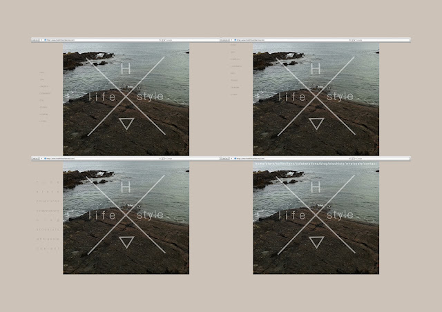
These are my first website idea mock ups, I decided on using the cross logo from before with the lower opacity logo as the main image on the website. I took screenshots of the browser with the fictional site address to try and make the mock ups look more realistic.
I created a site menu with usual heading such as Home, Store, Blog, etc... I used the same font for these as with the logo, keeping the flow through the whole brands image. I manipulated the text on illustrator, changing the spacing and layouts of the text.
My final site mock up idea. This was my favorite out of the other ideas. I think it looks very sophisticated and minimal, which is what I had intended. The menu is found to the left hand side and is easily read and fullscreen size, and the options are well spread out to avoid clicking on the wrong option. I think this idea could be easily used for the website and could keep a flowing theme and menu between all the pages.


No comments:
Post a Comment